
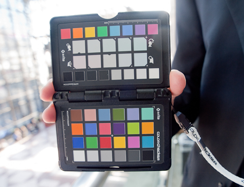
When I first saw X-Rite's ColorChecker Passport under NDA (Non Disclosure Agreement) last fall, I honestly wasn't quite sure what made it that different from other similar tools. After all, X-Rite already had an arsenal of respected color test targets that had recently been optimized for the demands of digital photography. The ColorChecker Passport itself is very handy design – a small set of three test areas in a small, easily pocketed black plastic case, slightly larger than a deck of cards, but much thinner, containing three interior panels. When unsnapped and opened, the first panel appears to be much like a standard set of patches, while the next sports some subtle color shifts in sequential form. The last panel is a larger single color patch designed for setting a neutral white point. It also shipped with software that allowed users to build a unique color profile for individual cameras, making it very distinctive. It runs on Mac and Windows, with full integration with Adobe Photoshop Lightroom. Several years ago, I interviewed Tom Hogarty of Adobe Systems on the introduction of Adobe's free tool to create camera profiles. The application, DNG Profile Editor, was available on the Adobe Labs site, and allowed users to create a custom camera profile. Despite the significant advances offered by the new beta application, which automated the process when a standard color checker was used, this was still a foreign language spoken only by serious color geeks, and way beyond the interest point of most photographers. Still, it pointed in a direction that was moving away from generic canned profiles. And, the time spent creating a custom profile was easily made up in post-production time – a bonus for studio photographers working with color critical subjects. There is a multitude of other excellent options to achieve accurate color, such as using a color checker, or a white balance tool, as this website has explored in earlier reviews. However, a custom profile is a different animal, with an accordingly higher level of precision and linearity and place in the workflow. So, while others have created very capable tools for this task, those tools have always been stand-alone products or incorporated into larger apps, as is the approach taken by Lasersoft and Phase One, and only a small minority took the time and trouble to do this. That's a shame, since for shooters using a bank of similar camera models, having a consistent profile allows for the creation of a standardized profile for all of one's cameras, with a standardized color sense to the final images, regardless of which camera body was used. And, the customized profile for each individual camera is often more accurate if done properly than are the profiles supplied with the system. My assumption was that once you had a reasonably accurate profile, you were pretty much done, similar to profiling a display, or printer/paper combination. You might need to re-profile or re-calibrate, but only on a semi-regular basis, for drift on a display, or for a new paper or ink combo. So, what exactly was the situation that X-Rite sought to remedy with the introduction of the X-Rite ColorChecker Passport? While the new color checker targets are solid tools, the real magic lies in the interaction between the targets and their new ColorChecker Passport software, supplied as both a standalone app, and a plug-in for Adobe Photoshop Lightroom. Just as important, the more I used the combination, the more attuned I became to the importance of recognizing the limitations of the standard dual-illuminant profile that is most commonly used. To use, simply photograph the target, making sure that at least 20 percent (I found that 50 percent was more effective) of the image was taken up by the target. Next, you either import the image into Adobe Photoshop Lightroom 2, or convert the image to DNG, either in Photoshop Camera Raw or with the free Adobe DNG Converter application. Using either the plug-in or stand-alone versions, the application is supposed to find the target and set sampling points on the target automatically, and in a minute, you have a custom profile. You can photograph the target twice under two different light sources, such as daylight and 3200K Quartz Halogen, to build a target that compensates for the lack of linearity of most sensors under differing light sources and levels, or you can just use a single source. The standalone version will only read DNG files, and the Lightroom 2 version can read the file on output to the plug-in, so it's not necessary to convert to DNG unless desired, but converting to DNG on import is certainly the workflow that DNG advocates would encourage. Unfortunately, this is where I ran into problems, the solutions of which opened up an entirely new set of questions. I'd been testing the new Olympus E-P1 Micro Four Thirds camera, and no matter what I did when I used the DNG I had created with the latest version of the Adobe DNG Converter, the software would report an error that it couldn't find the target in the image, and I was advised to try cropping the image to just the target. I did this several times, with the same message. So I tried the stand-alone version, which gave me another error, telling me that the DNG file was unreadable. Remember that the DNG was 100 percent readable in both Lightroom 2 and CS4 Camera Raw, but not in Apple Preview on Snow Leopard. Not knowing what the error truly was, after several hours of tests, I photographed the same target with the Olympus E-3, and this time the result was perfect. Both the plug-in and standalone version processed the file, and created a profile in seconds. When I compared the image on my calibrated (D-6500 @ 2.2 Gamma) MacBook Pro display (matte) to the actual color checker, compared to the stock Adobe profile for the camera, the colors were significantly closer, just about dead-on accurate to the actual checker when viewed in Lightroom 2. I also wondered why Apple Preview would read the E-3 file just fine, but refuse the new E-P1 file, stating that it wasn't a supported format, in either the DNG or Olympus Raw Format (ORF) versions. While Apple has updated Aperture on a fitful basis to accept some newer Canon or Nikon cameras, it's a bit on the kludgy side, and the range of updated models is normally quite limited. And besides, shouldn't Aperture read a DNG file, whether the camera is supported or not? Isn't that the point of the DNG format? A bit more later on Aperture's inability to import a modified DNG. So, I contacted a couple of colleagues – Andrew Rodney, our favorite Digital Dog, and Seth Resnick, our favorite D-65 guy. Both made some observations that proved useful, and Andy's suggested that I try Adobe's DNG Editor to see if I could make a profile that way. What I discovered upon following his lead was that it worked perfectly on the E-3 file (not a surprise as I have used it in the past with that camera), but it refused to import the E-P1 file. Was there something amiss with the newer Olympus file? Was there some of the legendary "secret sauce" that so many camera companies insist is the reason they won't allow folks to have DNG as a save option in their cameras? The answer is yes, but not in the way you might think. When I contacted Tom Hogarty at Adobe for his thoughts, he replied, "When converting the Olympus EP-1 proprietary raw file format to the open DNG standard, the resulting DNG files take advantage of the latest DNG specification and the associated geometric lens correction opcodes provided in the DNG 1.3 specification update. The DNG Profile Editor has not been updated to work with those updates so a photographer would need to change the DNG conversion compatibility settings to Camera Raw 4.6 or later in order to read the image within the DNG profile editor. We will update the DNG Profile Editor in the near future to address this lack of compatibility." It seemed that it might also solve the problem with the X-Rite Passport since the hitch seemed that the Passport software might not be able to read the newer DNG specification either. And right he was. I changed the preferences in the DNG Converter to 4.6 and later, processed the image, and then imported the image into Lightroom 2, as well as into the standalone Passport application and, voila! Both versions were able to quickly process and create a custom profile, automatically. On a related note, Apple Aperture 2.14 would import the new DNG, but was not able to actually get beyond the embedded JPEG preview, and Apple Preview still couldn't read it. Adobe hopes to update the DNG Editor so it can support the new DNG format, but it might take some time. There are two lessons here. The first is that the DNG spec isn't set in stone, and it's continually updated and improved, which is a good thing. Because DNG is Open Source, all the code and specs are freely available, which is a great thing. The second lesson is to just acknowledge that camera companies are creating new cameras that pack more data into the RAW file format, which is also a good thing. Users just have to be aware that both specs need to be in sync. And if an application isn't geared up to support the latest DNG format, then you might need to downgrade the DNG to an earlier version as a workaround. Even though I had a review copy and direct access to X-Rite tech support, I prefer to try to sort out problems on my own, as a consumer might need to do. So, I headed over to the support provided by X-Rite for the Passport on their site. And when I clicked on the link to "Learn More" when I was receiving the error messages, I was led to a troubleshooting area on their site that had no references to actual error messages, only to a few FAQ's about installing the software for example. In contrast, their training area is first-rate, with a slew of information, tutorials, and videos on using the Passport. I ran out of options, so I got in contact with their tech folks. After a number of phone calls and e-mails, I was able to confirm the issue, suggest a work-around, and in short order, X-Rite posted updated tech notes on the issue. A few weeks later they issued the first update for Passport, and it solved the problem. I was glad for both, for working with me to isolate, troubleshoot, and provide a workaround, then to quickly post that info for all to read, and to address the issue with the updated software. The update worked perfectly, and enabled me to process the original captures using the most current DNG specification and conversion. OK, on to the actual profiles. In both cases, the custom profiles were an improvement over the Adobe stock profiles. Because Olympus' RAW formats are essentially just that, RAW files with no camera induced style changes, there is only a single Adobe profile for their cameras. This is in contrast to Canon and Nikon, for example, who have several types of profiles for their raw files, with an emphasis on a certain effect on the image such as Vivid, Landscape, or Portrait, etc. Using the Passport allowed me to instantly create images that unlocked the colors I was seeing (or at least that I perceived that I saw) when I took the image. The grayscale patches in my targets were virtually identical between the Adobe profile and the new X-Rite profile, but the colors were a bit faded and flat in the Adobe-supplied profile in comparison with the new profile. Naturally, you can choose either profile when processing the file and choose the one that gives you the desired results. The Adobe Profile seemed more neutral compared to the custom one, but as time goes on, you will choose the appropriate profile, which is in itself a huge improvement over having no choice! For the hard-core color folks, you can still open the profile and edit it further using the DNG editor, and there is no doubt that your friendly neighborhood color geek will bemoan the lack of patches and control. But that isn't an obstacle if the new profiles match your vision to your camera more precisely. When I bumped into Seth Resnick at PhotoPlus Expo in New York, I gave him a hard time about the need for so many custom profiles. Did photographers really need to create a new profile every time images were shot in a new location? He did his usual chuckle and said that I'd find out, and darned if he wasn't right. The new profiles are for the most part a significant improvement over the stock ones. I'm finding for example that I don't need to use the Vibrance option in Lightroom 2 or 3 as much, with the new profiles providing the punch that led me to make the image in the first place, and I'm seeing more accuracy and subtle shifts in the colors, especially in pastels. Not insignificantly, an accurate profile cuts down on post-production time trying to tweak the colors just right. In my tests, the new profiles showed less crossover, so that a correction to flesh tones didn't necessitate a change to other aspects of the image, nor the need for masks to control the shift. With the custom profiles, the image was more accurate to begin with, so less manipulation was required later. You can also batch an entire shoot with the new profile, so purely in terms of the time savings, it is multiplied over all the images. When I first started on this review, the ColorChecker Passport was under NDA, was released to the public, passed through an update cycle, and gained measurably in functionality and speed. When it was first released I had some issues with the software properly finding the target to assign the patches, but that problem vanished with the first update. Once the initial teething issues of any version 1 release were ironed out, I was free to really look seriously at how to best use the system. Seth's chuckle about finding that he wasn't exaggerating the need to create a slew of profiles was prescient. The keys to this epiphany were questions about the nature of the profiles themselves. Along with most folks, I would open a RAW file, using the standard profiles provided by either the camera companies or that came included with the imaging editor at hand. Then I'd search for a neutral, or if I'd had my wits about me, take and use the photo of the white balance tool that I brought we me on the shoot. But, even then I noticed that in some lighting situations, some colors would render spot on, while others had casts that were devilishly difficult to remove. Even with all the tools in Photoshop CS4 or Lightroom 2, color correction seemed a hit-or-miss situation. For example, I found that for the most part, color corrections were fine in either daylight or in studio or a room lit by halogen bulbs. But, other conditions were just a mess. Curiously, it seemed like the problems of C-printing in a color darkroom whose color processing line wasn't linear, which caused unpredictable color shifts. The crossover is designed into modern photo materials, but when things go out of whack, the response isn't accurate, and funky colors result. Out-of-date film, and chemicals that are exhausted, poorly maintained, wrong temperature, or under lighting conditions like emissive lamps can wreak havoc on color balance. I'm an old hand at building color profiles, so suddenly it started to make sense. So, what makes sense? In a traditional setting, color film is designed for essentially two light sources, daylight or tungsten at 3200 Kelvin, or a standard issue photoflood light. In the digital age, sensors are profiled much the same way. Point the camera at a known target, use a known light source, such as daylight or tungsten, and use the two images to generate a profile, one that conceivably should cover the range from daylight to tungsten with a smooth linear ramp or transition - no muss no fuss. Those profiles are referred to as "dual-illuminant" profiles, which contain profile data for two different light sources. This makes sense, and in fact is what most of us have been using all along ... and just as the exception proves the rule, it is why it's been so difficult to achieve good color with a single click in difficult lighting situations. So, just use a color balance tool, right? The answer is yes, a carefully constructed and calibrated tool will allow for a much better white balance in a single click in a particular lighting situation then all the bouncing about with the White Balance tool can normally pull off. Just the use of a good tool, such as one of X-Rite's targets can make life a lot easier. But it can only do this to a point. Without an accurate profiling of your camera, you are still working to overcome any bias that might be present from the particulars of your own gear. Just like a difference in latitude results in bluer light to which film is more sensitive as you travel north, the mere idea of a single reliable neutral is a bit of a myth. So, I have come to view standard profiles as accurate but safe profiles that seem to reflect an averaging of different captures. By using the ColorChecker Passport, I found that my own daylight profiles, for a specific situation were more accurate, not in any theoretical way, but in a practical and aesthetic way. Colors simply mapped into place, skin looked like skin, and landscapes were shed of color shifts. I gave Seth a hard time since I couldn't imagine that every lighting situation deserved not only a white balance target image, but a custom color profile as well. But, it's true. Want dead on accurate color with almost no effort? Take two photos in a given lighting situation, one of the profiling target, and one of the larger balance patch, and you will be amazed at how quickly and accurately your color will render. You can even shoot just one, since the target has the larger patch included in it, although I like the larger target in practice. Like the "Zonies" from the Zone System workshops I used to teach, some photographers can go overboard so that they technique is more important then the image, and most shooters not working on commercial assignments will surely not be into creating a custom profile every time they shoot. For the studio shooter, just generating a profile for your strobes or hot lights with your own camera, will result in more accurate images. For the wedding or event in a hall, a quick profile will give you better and faster results. And even for the editorial shooter or journalist, shooting an occasional test target means more control of the color later on. For the OCD shooter, each corner of an interior might have different lighting, but I've found a few patch photos will cover the event. I have to agree that a single custom profile for a specific or general light source is best, even if not always practical. So much for the dream of a perfect dual-illuminant profile! Is this all worth it? If you'd asked me when I first started profiling more than 16 years ago, I'd say "Gosh, no!" It seemed just too much work, too many variables, too time consuming, and the end result was often pretty flaky, but this is an entirely new era. This isn't geek stuff, and after a 15-minute demo, my college photo students have their "Aha!" moments, and soon everyone wants to make a profile. And, if you compare the new profile's impact on their images, no more discussion is necessary. This is only a beginning. Profiling is a dark art, and even Harry Potter needs his nemesis Snape to assist with some situations. But the fix is in, and while one can dive in deeply to the creation of profiles, the ColorChecker Passport makes this an approachable solution. I found that, just as in printing, a profile only gets you 95 percent there, the rest is up to your eye, your needs, and the emotional stance that you want your work to impart. Importantly, generating profiles and seeing the impact they have on your work while processing your RAW files, is an eye opener. The ColorChecker Passport is aimed at a simple, easy-to-use workflow, and for advanced users, they might still want to get in and manually tweak the numbers (but that is more the province of my colleagues who wear those fabulous X-Rite Coloratti blazers, than that of most working photographers). With the introduction of the X-Rite ColorChecker Passport, image makers have entered into a new age wherein digital photographers are encouraged to take serious control over the colors they hope to capture and create with. That it is now virtually foolproof and easy to use is proof of the importance of X-Rite's accomplishment, building upon years of color management research. I believe that the X-Rite ColorChecker Passport is a tool that photographers who are serious about their color won't be able to live without once they have tried it. The best part is that it's entirely painless, something that is a marvel to anyone who has just given up on color management in the past. Harris Fogel, Posted 7/8/2010, updated 9/10/2010 For more information on the X-Rite ColorChecker Passport visit: www.xrite.com Photos are ©Harris Fogel 2010 |